UI and UX Design for a B2B App
Full-Time Employment
Full-Time Employment
Skip to section
Roshi is built on a complex framework of calculations and dependencies based on user-entered data. I work with the Product Manager, Chief Technology Officer, Software Architect, and CEO to develop user flows for new features and modules, with a focus on simplifying tasks for our customers. I create and present draft designs to the team and help define technical requirements.
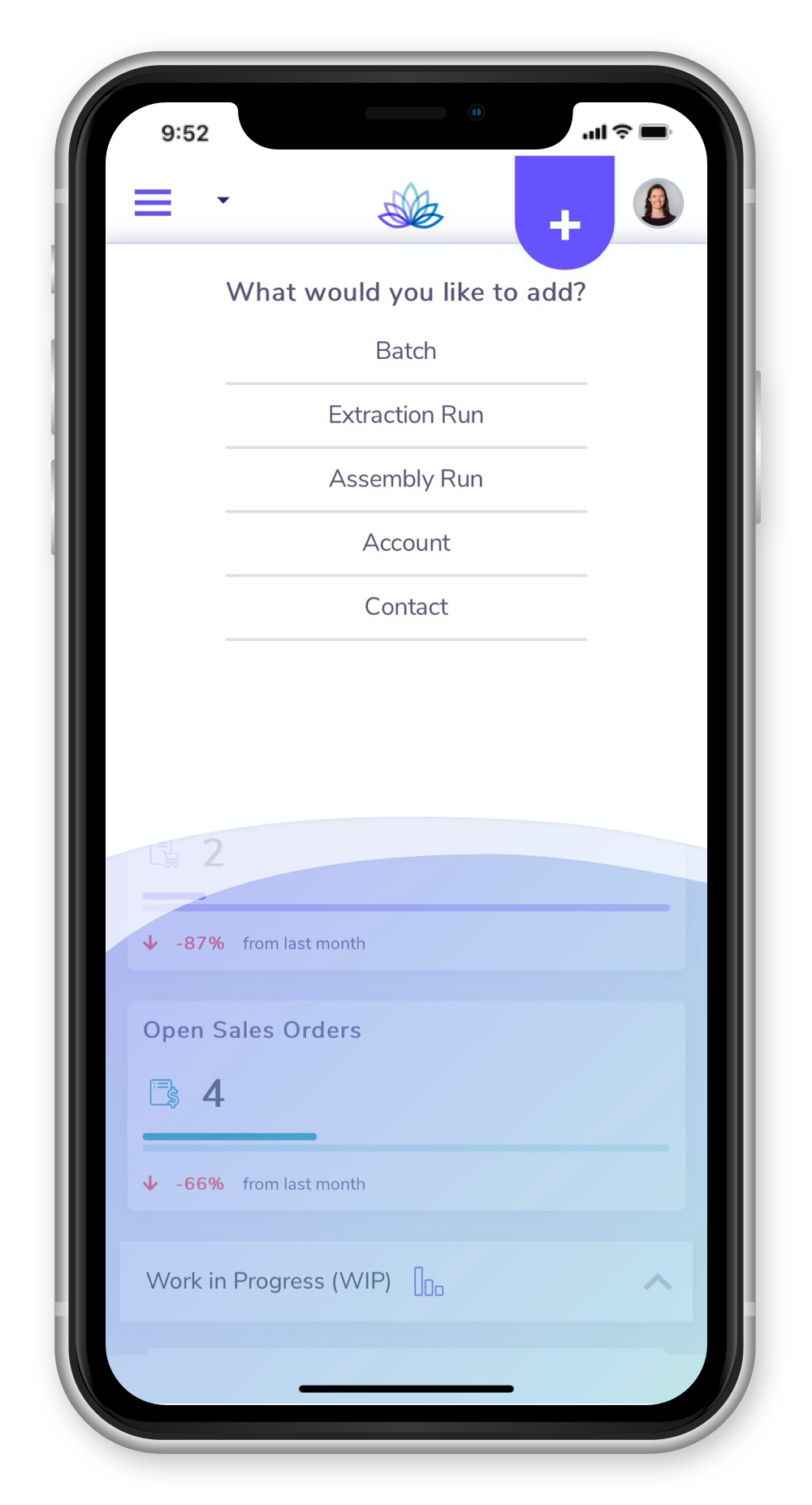
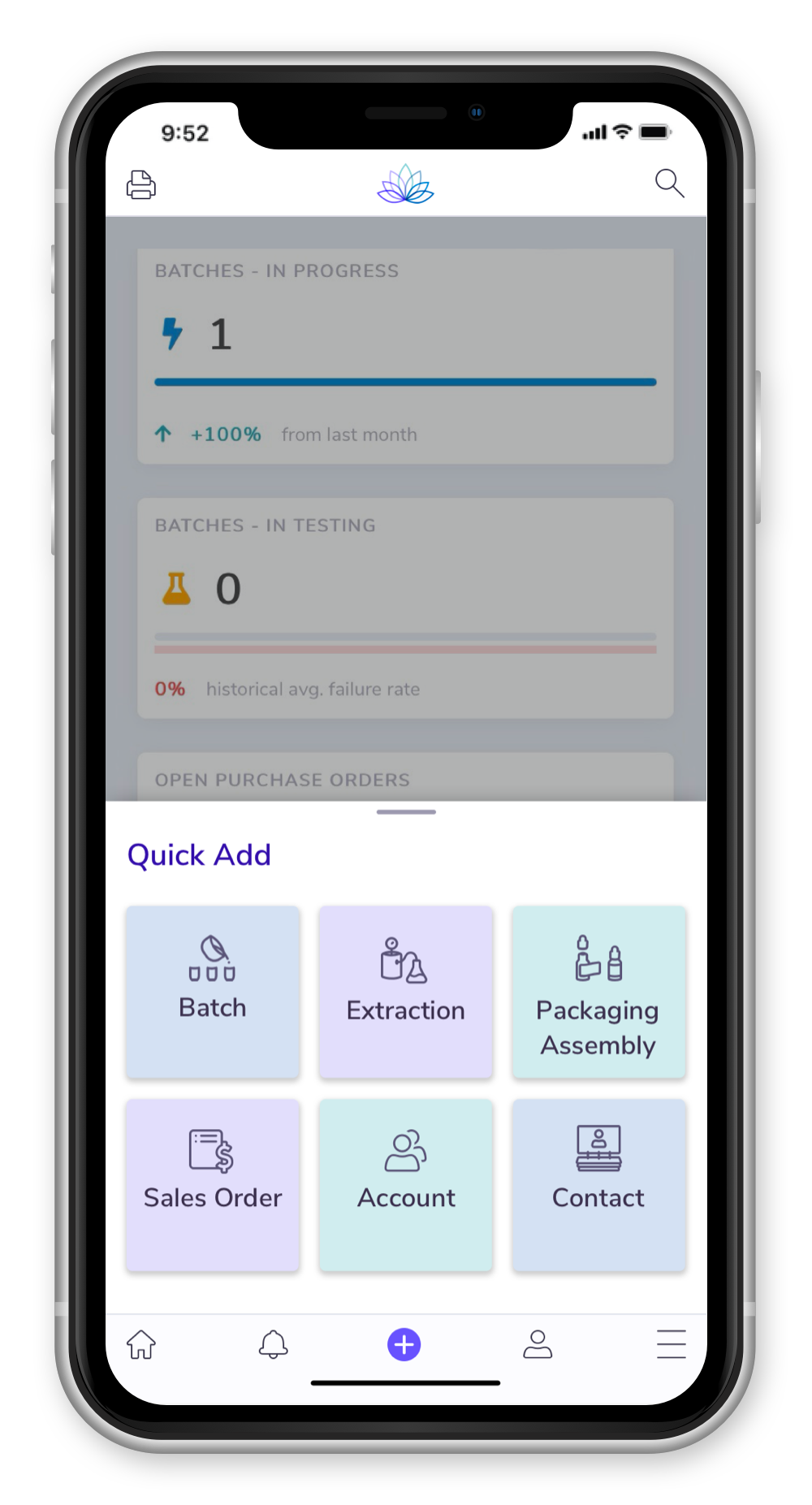
The app navigation menu was initially designed for desktop, and users noticed that it did not translate well to mobile.
I redesigned the mobile navigation structure, introducing a bottom nav bar and reorganizing features into a flat navigation structure. Now the navigation behaves more like a mobile-first app.
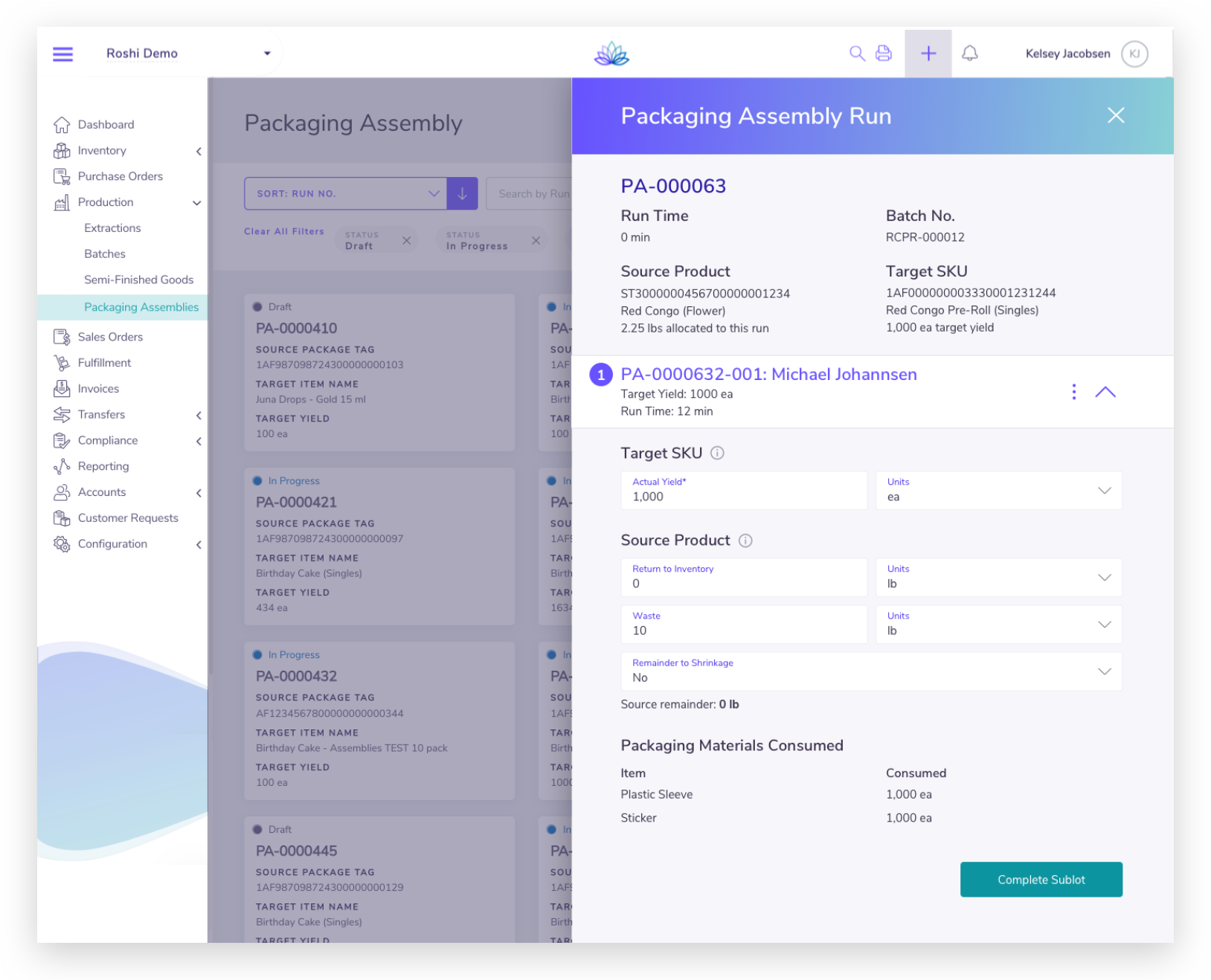
Users found one module to be too long, with too much data entry and unclear terminology.
I did a full sweep of the user flow and consolidated the number of screens by 30%. I set fields to auto-populate where possible to reduce the need for manually entering data, and aligned all terminology across the module. Now, customers that previously avoided using the module due to its complexity have begun to use it in its streamlined form.
Arrows point out some of the issues I found throughout the original screens.
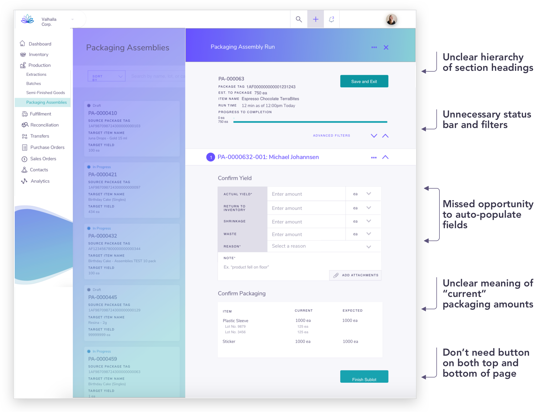
In addition to some style updates, all issues above are addressed.
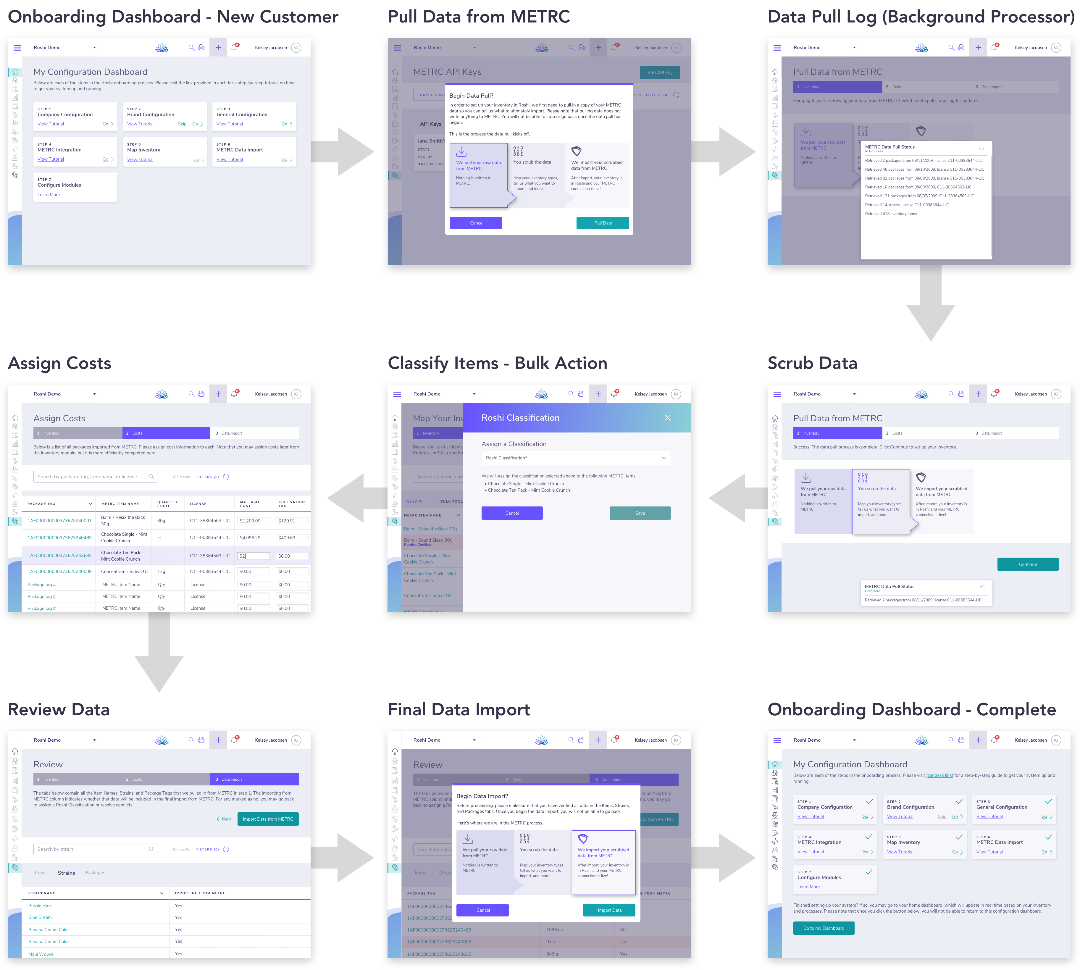
Roshi began with a small number of customers, and was therefore able to provide “white glove” onboarding, where Roshi Customer Success configures customers' system and imports their data. As we take on more customers, we will need a streamlined onboarding process that customers can complete themselves.
I worked with the CTO to develop screens and step-by-step graphics for a new, user-driven onboarding sequence. This feature greatly reduces the burden on Customer Success and enables Roshi to take on an increasing volume of customers.
While the details are pretty technical, the main point is that users can now configure their Roshi system and set up data integrations themselves thanks to a customer-facing onboarding flow.
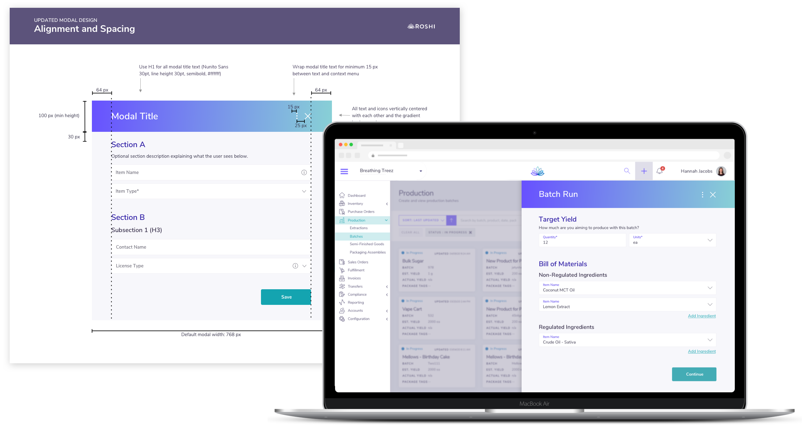
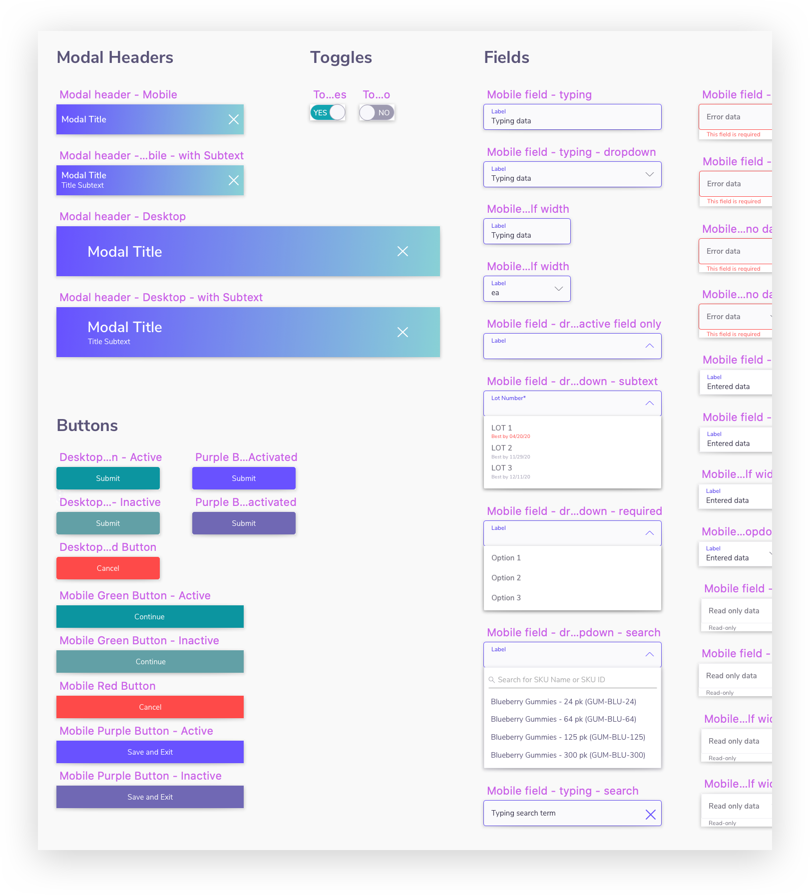
When I joined Roshi, the company had a small design library containing a logo, color palette, brief style guide, and MVP screen designs. There was no central repository of reusable app components. I took the opportunity to build a comopnent library and create a more detailed style guide. I also redesigned several components for improved usability, including fields, filters, and the calendar date picker.
The MVP screens and UI components were developed on an ad hoc basis, with no source of truth for the specifics of reusable components. This led to inconsistencies across the app and time wasted tracking down or re-creating designs.
I made a library of reusable Sketch components, including buttons, icons, mobile navigation, context menus, dropdowns, and all states of the updated field designs. Now, I can provide Development with consistent designs and save time building screens.
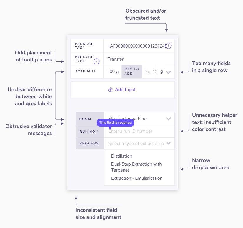
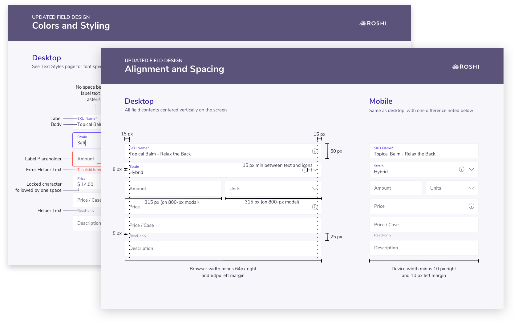
The app contains many fields where users enter or select responses. However, the original field design looked outdated and took up too much horizontal space. Customers were frustrated with truncated or overflowing text, which occurred mostly on mobile. (And I was frustrated with how wonky and inconsistent everything looked!)
I saw an opportunity to use floating labels - which are both more modern and eliminate the horizontal spacing issue. Using Material Design’s floating labels as a reference, I applied Roshi’s style and created detailed specs for each field type and state.
Arrows point out UI issues.
All UI issues are addressed.
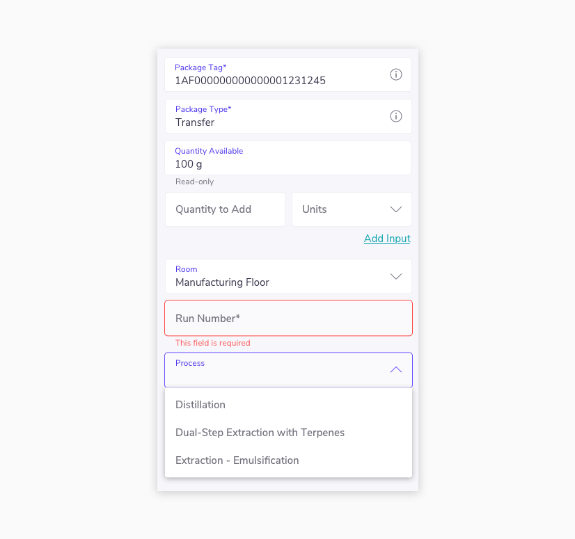
I detailed the designs for each field type and state to guide our developers.
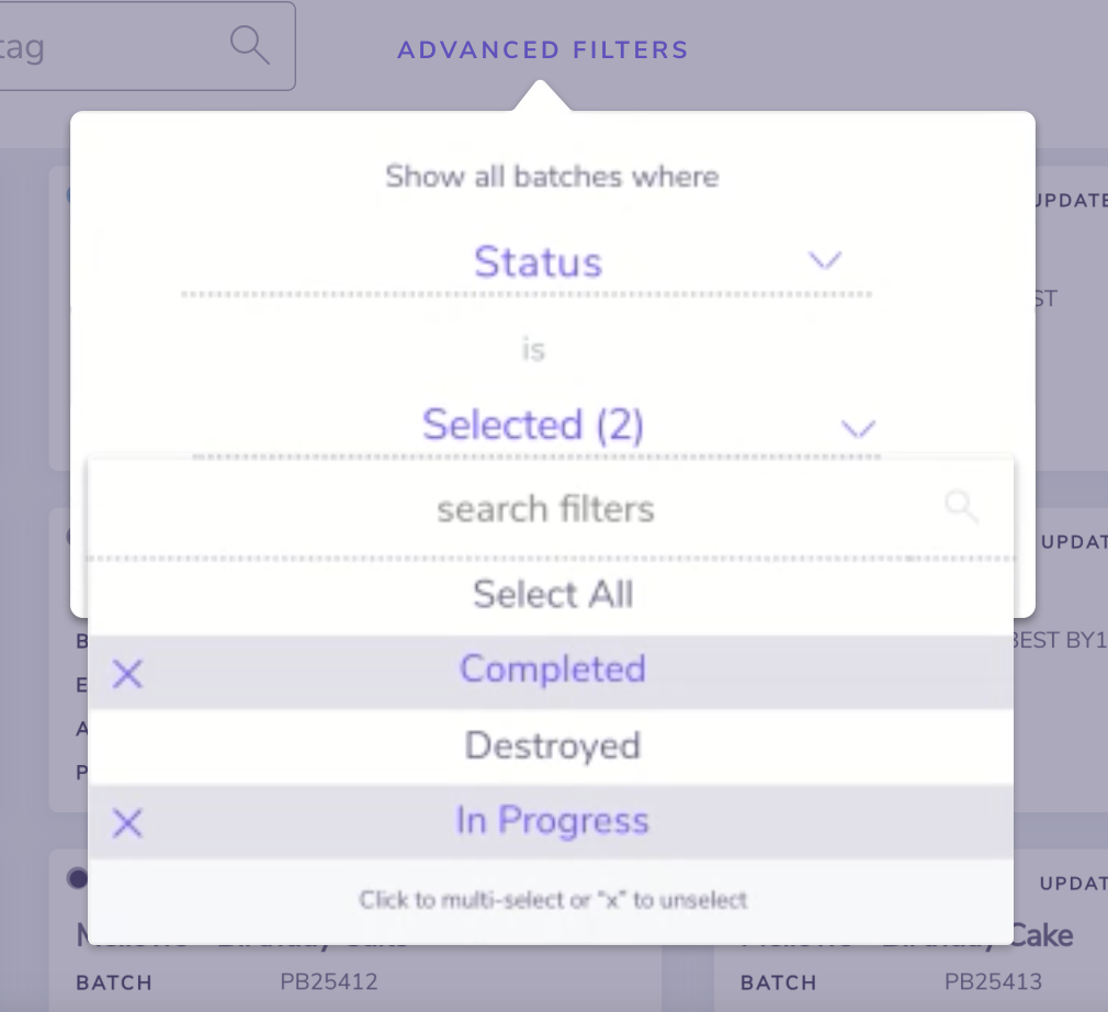
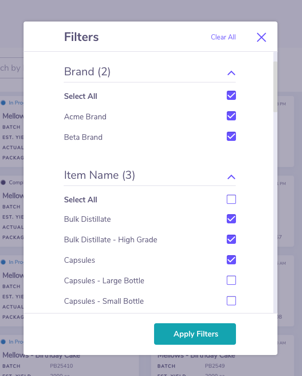
Customers were frustrated with the original filter component, which was clunky, non-intuitive, and took too many clicks to navigate.
I redesigned our filter component from the ground up, opting for a more expected pattern using categories and checkboxes. The new design requires 3 clicks to complete, whereas the original took 7.
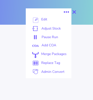
The original icons were created or download on an ad hoc basis, and as a result they were inconsistent in size, stroke width, and style. This required the dev team to maintain page-level CSS for each one, which was time-consuming and only partly solved the style inconsistencies.
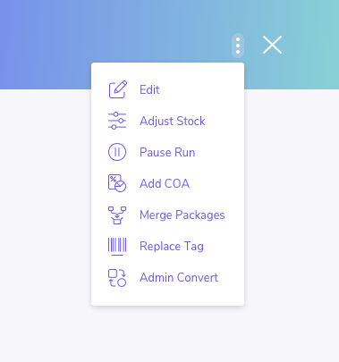
I redesigned all icons from scratch, resulting in a library of more than 70. Now, all icons are uniform in size, line width, and style, resulting in a more polished, on-brand experience.
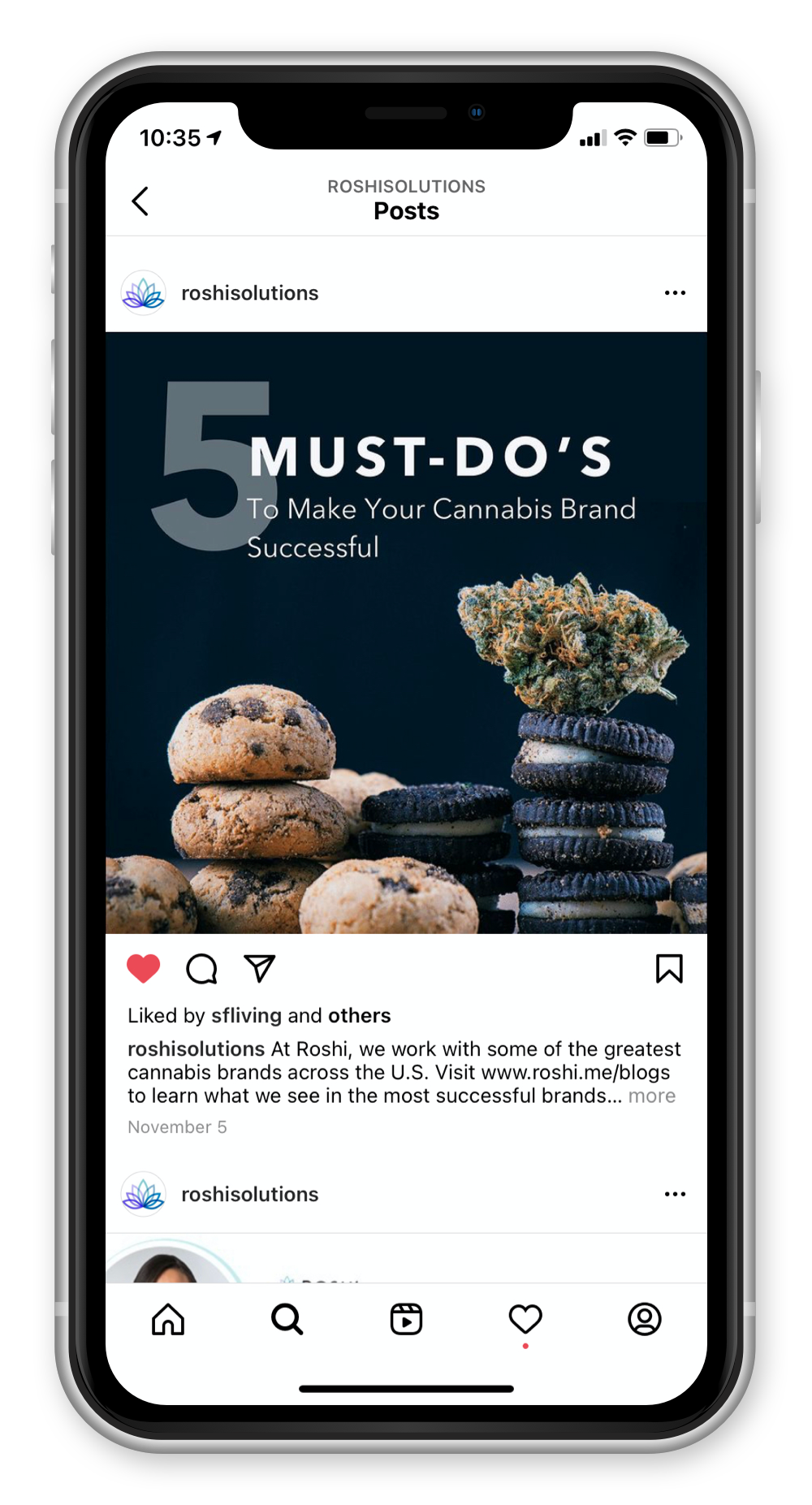
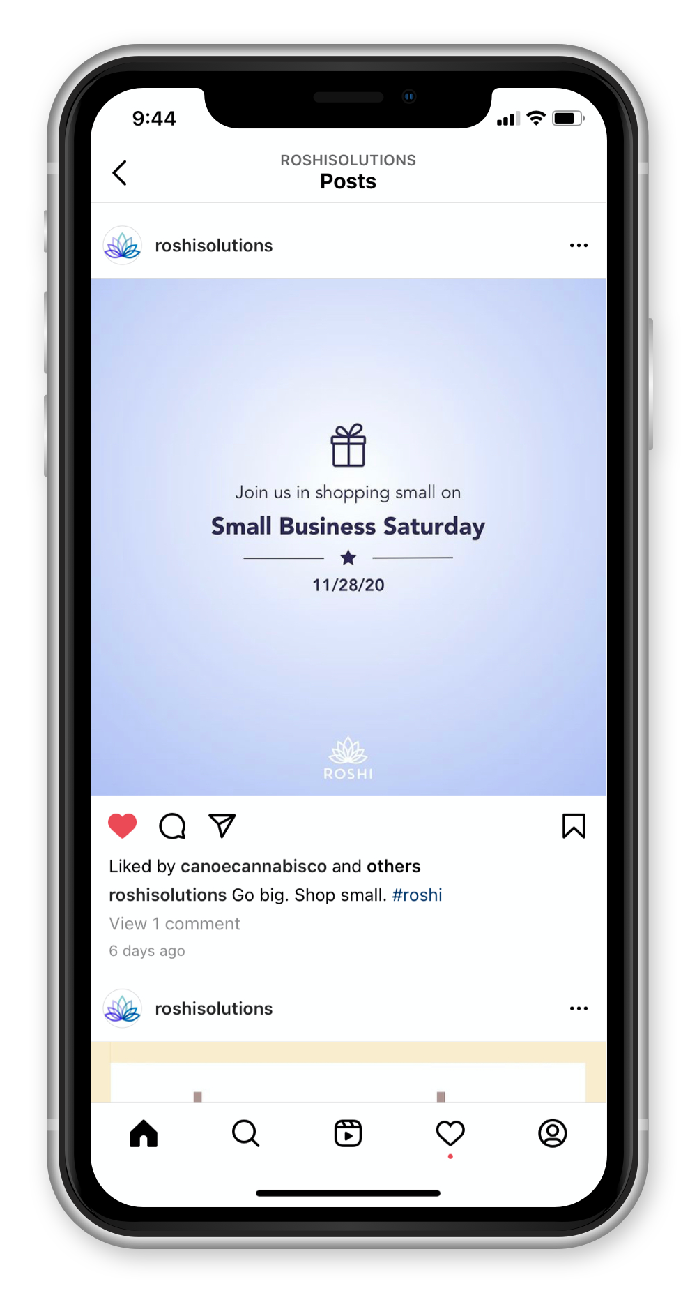
Part of my role is to support marketing and customer success by creating images for social media posts, marketing email layouts, new web page layouts, product shots, and schematic diagrams.
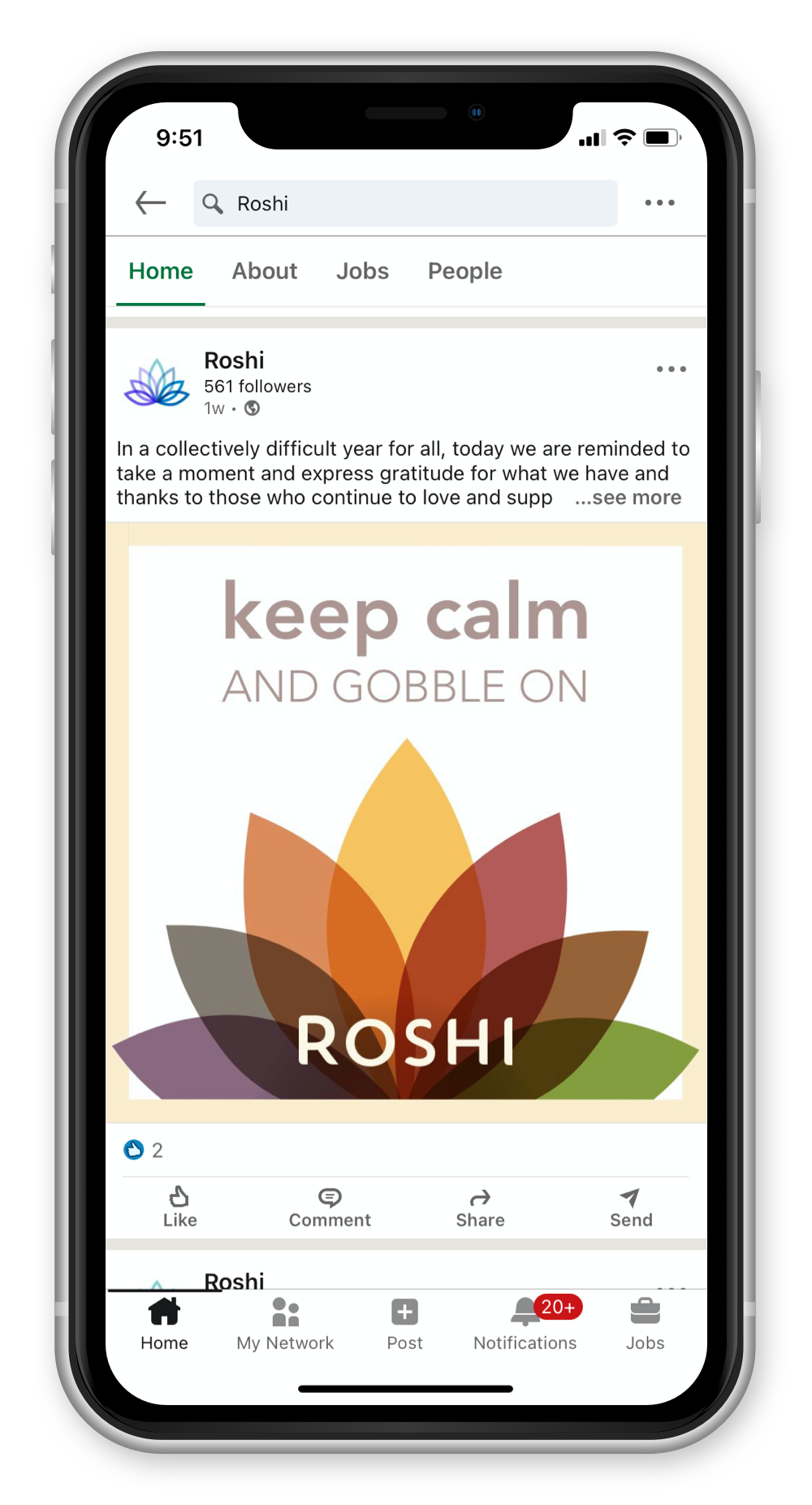
Roshi needed to up its social media presence with high-quality content.
I create assets for social media posts.
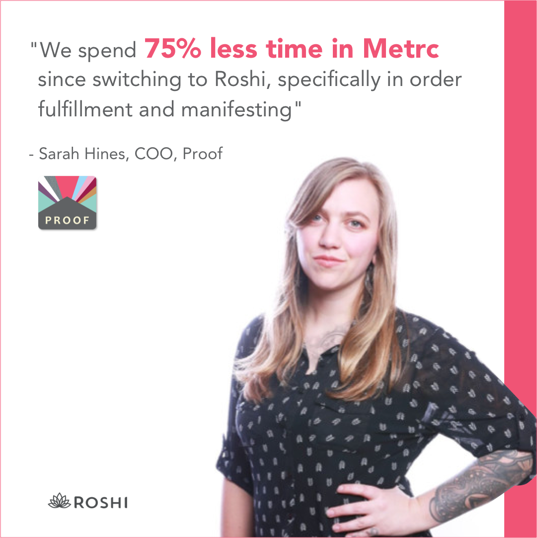
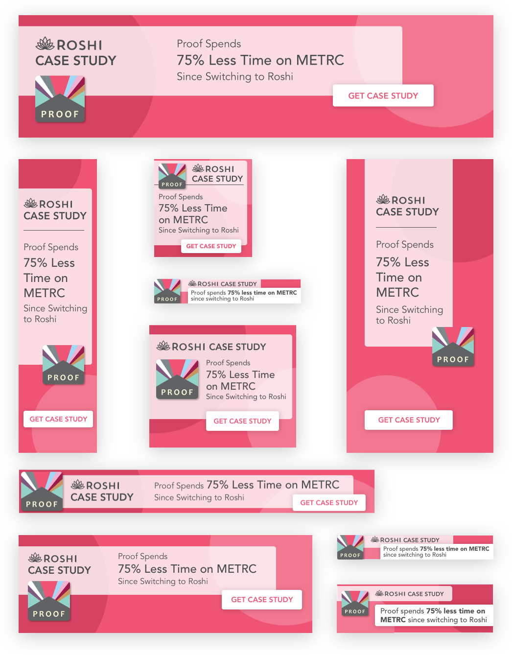
Roshi hired a digital marketing contractor to generate leads with placed ads. They needed someone to design the ads.
I develop eye-catching designs and refactor them to fit each dimension needed to display on various devices.


Reach out if you'd like more detail on my work for Roshi. Meanwile, I'll be drafting up new screen designs and style guides!