Ease your writing process
App Concept

App Concept
Skip to design process step
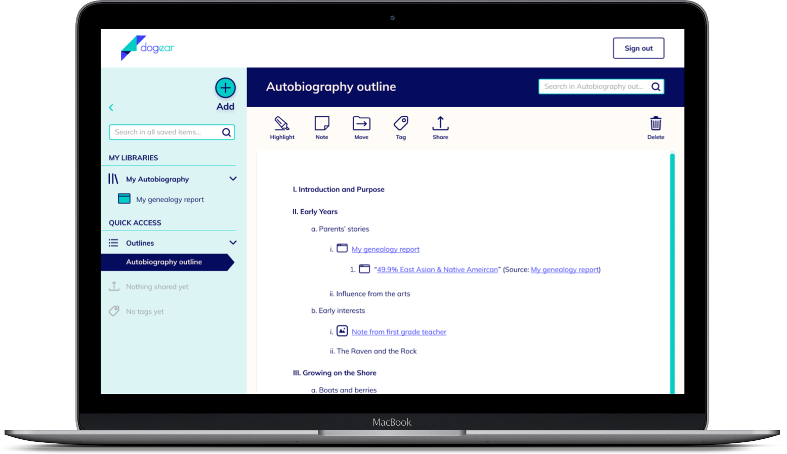
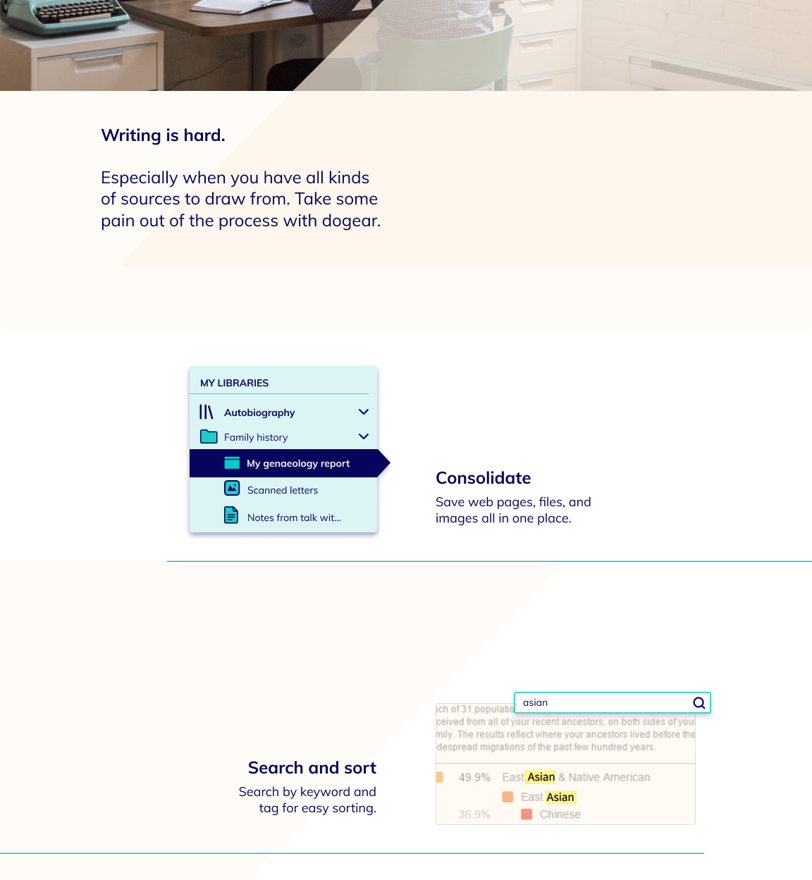
Writing is hard. Especially when you have all kinds of sources to draw from. How many times have you saved a bunch of source files, then when it came time to write you couldn’t remember where you read that important fact?
Dogear allows you to spend more time writing and less sifting through files.* Organize everything by project, search by keyword, and tag sources for easy access. Drop sources into your outlines, so they’re right there when you need them. You have the information and inspiration; dogear just greases the wheels.
*This project is a concept and has not been shipped.
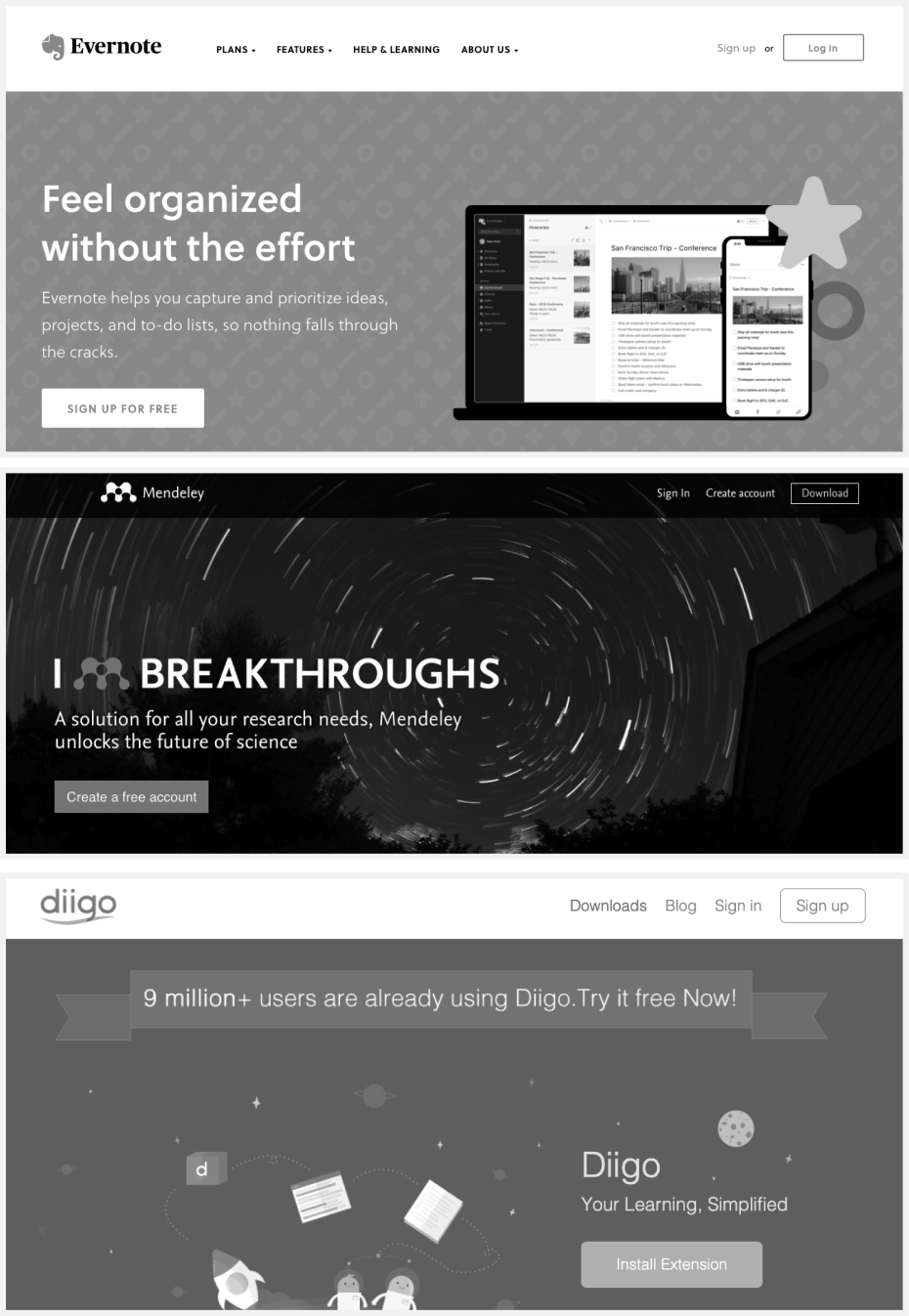
I started by surveying the landscape, looking into three existing cloud storage platforms that writers might use.

There are lots of things that work well in each of these platforms. Each of them has different strengths, but there is no one that provides a comprehensive set of features especially for writers, like the ability to:
Faced with a blank slate - a prompt to develop a cloud storage platform - an initial challenge was to pinpoint an audience. My writing experience led me to believe there could be a gap in the landscape of tools designed specifically for writers.
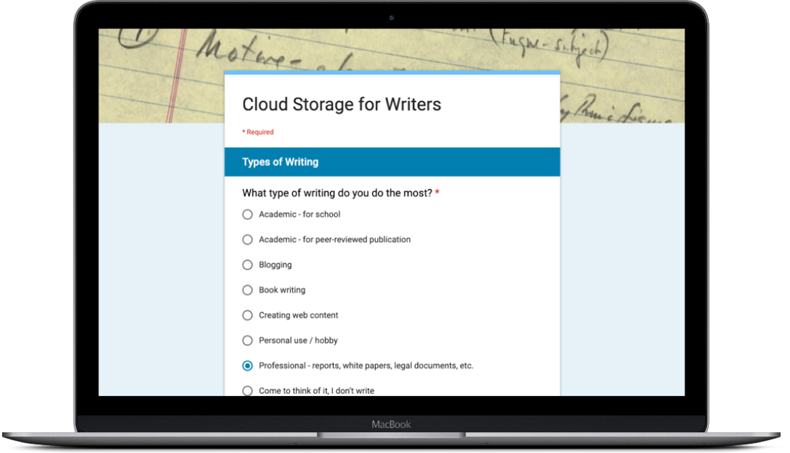
28 people shared insights through an online survey.
Paired with the gaps in the competitive landscape, the survey helped me see an opportunity for a new cloud storage platform tailored for writers. Below are some key findings from the survey.
Survey respondents most often write for professional, personal/hobby, and academic purposes.
Most use a general cloud storage platform like Google Drive.
They compile sources by copying links into a text document, creating internet browser bookmarks, and/or saving files to a local folder.
Writers have difficulty organizing and searching through large numbers of files, especially when they’re saved in multiple places.
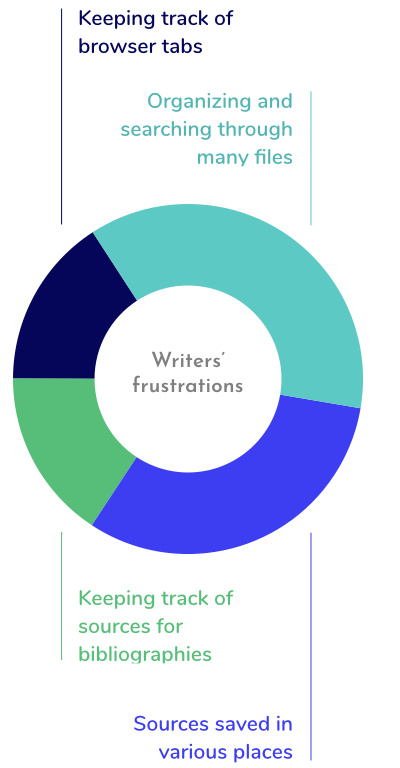
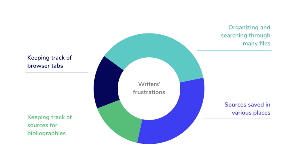
A couple survey questions could have been more straightforward. Survey respondents are volunteering their time and don’t always read questions carefully, so in future surveys I’ll make clarity and brevity a stonger priority.
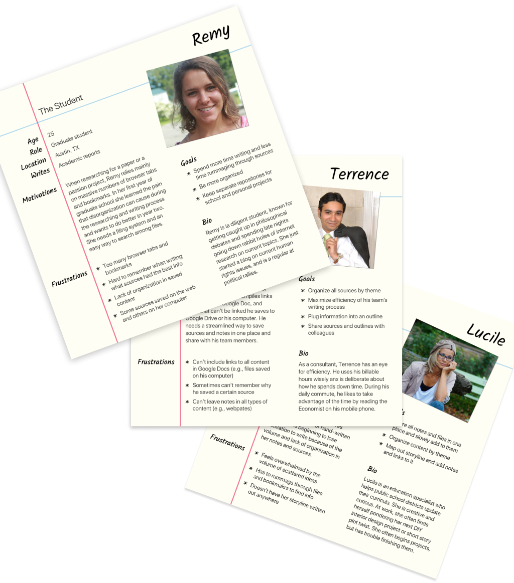
The online survey gave me the information needed to personify the target audiences for the new product.


With the personas in mind, I needed to clarify: What do these people want a new platform to do?
User stories truly shape an MVP. The UX and UI design that follow flow directly from the selected stories, so choose carefully!
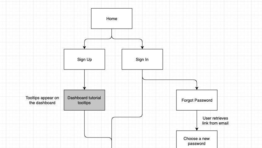
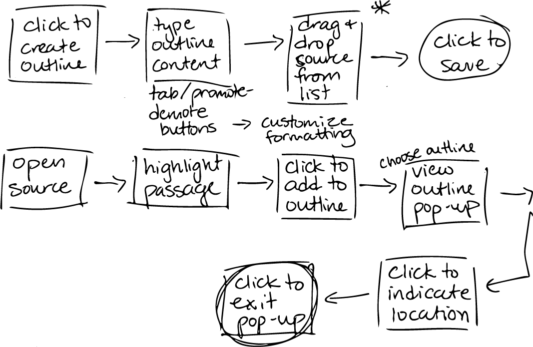
To map the process for accomplishing user stories, I created user flows - first rough paper sketches and then digitally.
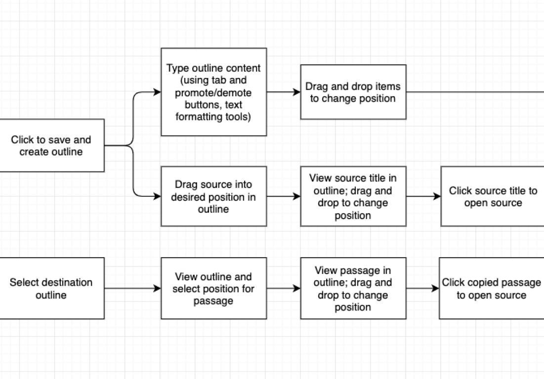
But what screens will users see as they move through the flows?
I found that after the onboarding process, the sitemap is pretty simple: almost everything happens in the user’s dashboard and popover forms.
With the sitemap in hand, I drafted a content strategy for each of the main screens. I would refine the content throughout the design process.
While creating user flows, I realized that there could be many ways to use the various elements (start/end oval, decision point diamond, etc.). Each team might use symbols slightly differently.
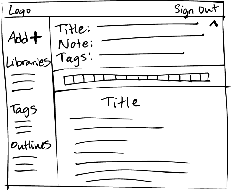
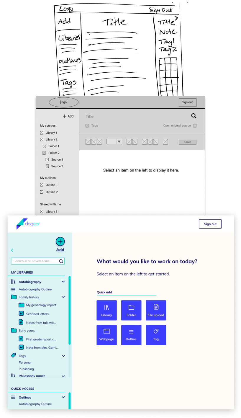
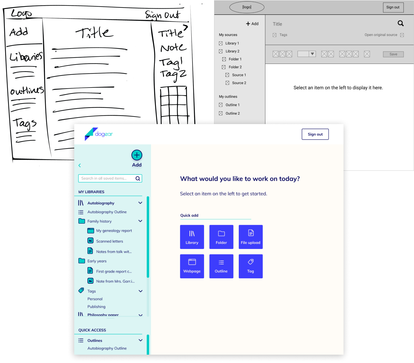
I started by iterating on the basic information architecture of key screens - again, on paper and then digitally.
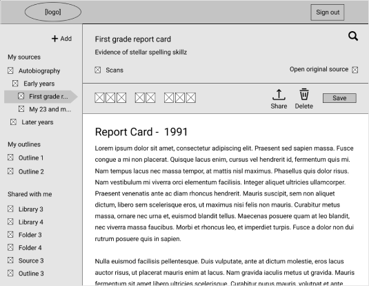
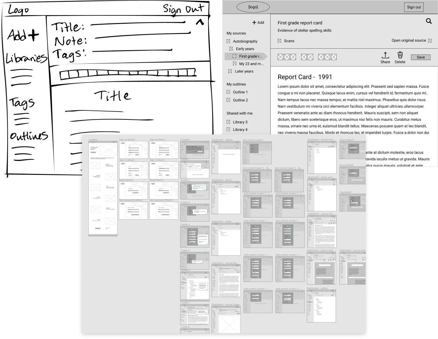
I tested the low-fidelity clickable prototype by asking three users to perform a few tasks:
Testers found a few stumbling blocks that I needed to address. Revisions that helped included:
For example, here is how I refined some of the icons.
Showing various states of a screen often means duplicating and modifying the screen mockup. So, avoid endless updates by making sure the base mockup is right before rolling it out!
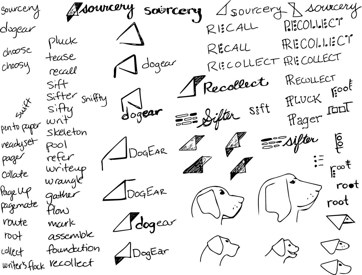
Lots of sketching and word associations left me with diverging options for the brand’s name and logo.
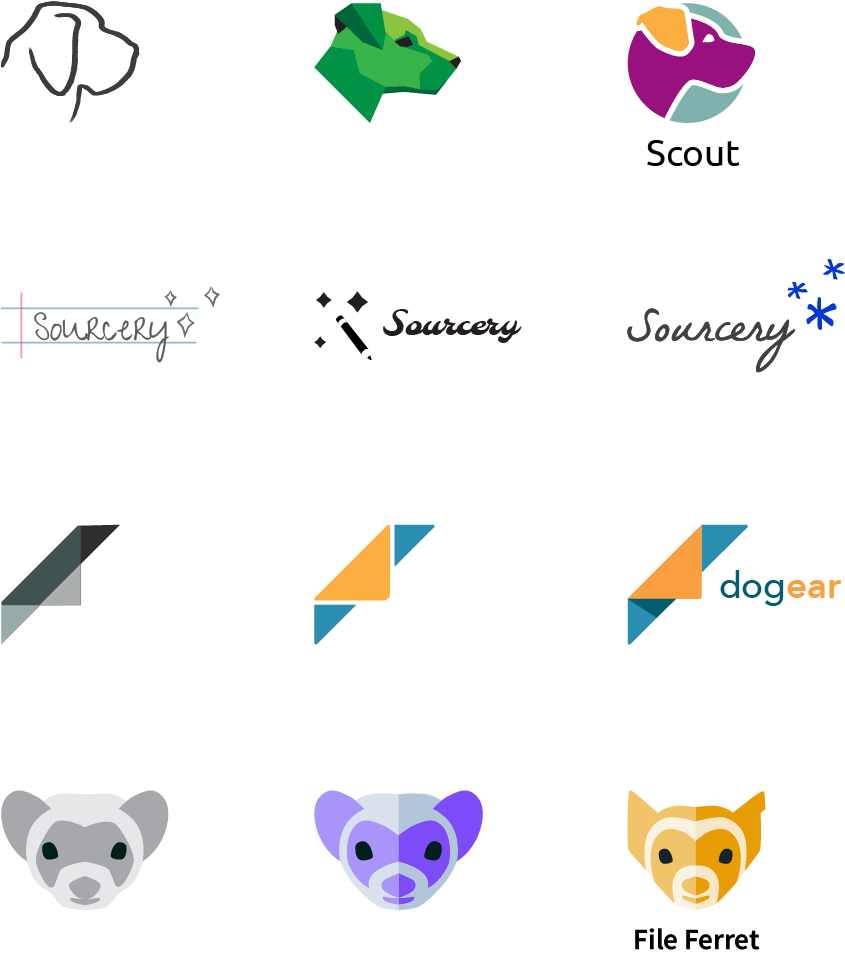
Not sure which concept to run with, I turned to users for their opinions on four options.
The results were clear: users liked dogear because it most tangibly relates to the purpose of the platform.
I was surprised; I thought the dogear logo was a bit boring, even dated. I wanted it to be more modern, edgy, and relatable.
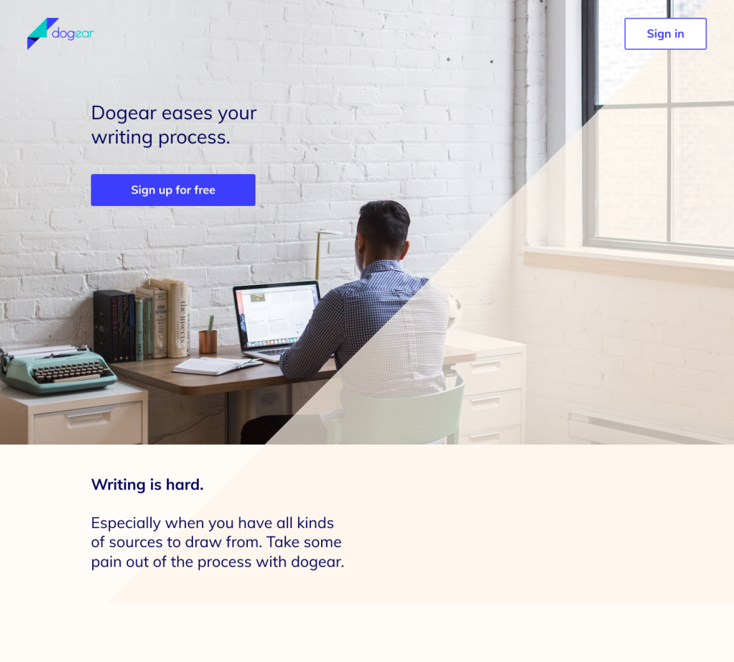
One key change was to update the colors, where vibrant blues are associated with computers and technological energy. I also swapped out the typeface for one that’s lighter and more contemporary, complementing the logo’s 45-degree angle.

I sent the logo preference test in color, but next time I’ll use greyscale so participants aren’t swayed by their color preferences. I might even deploy separate tests for the name and logo, since the logos got much more attention than the associated names.
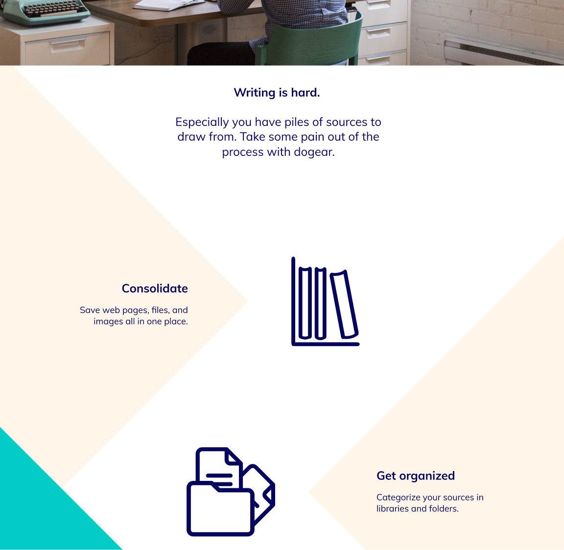
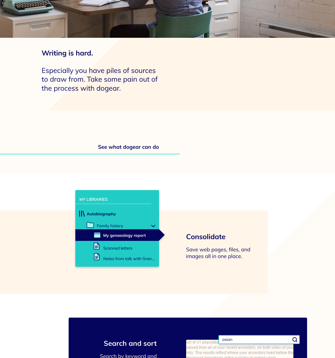
I had to work through some ugly first tries to get to a more polished look and feel.
And at this point, there was a twist.
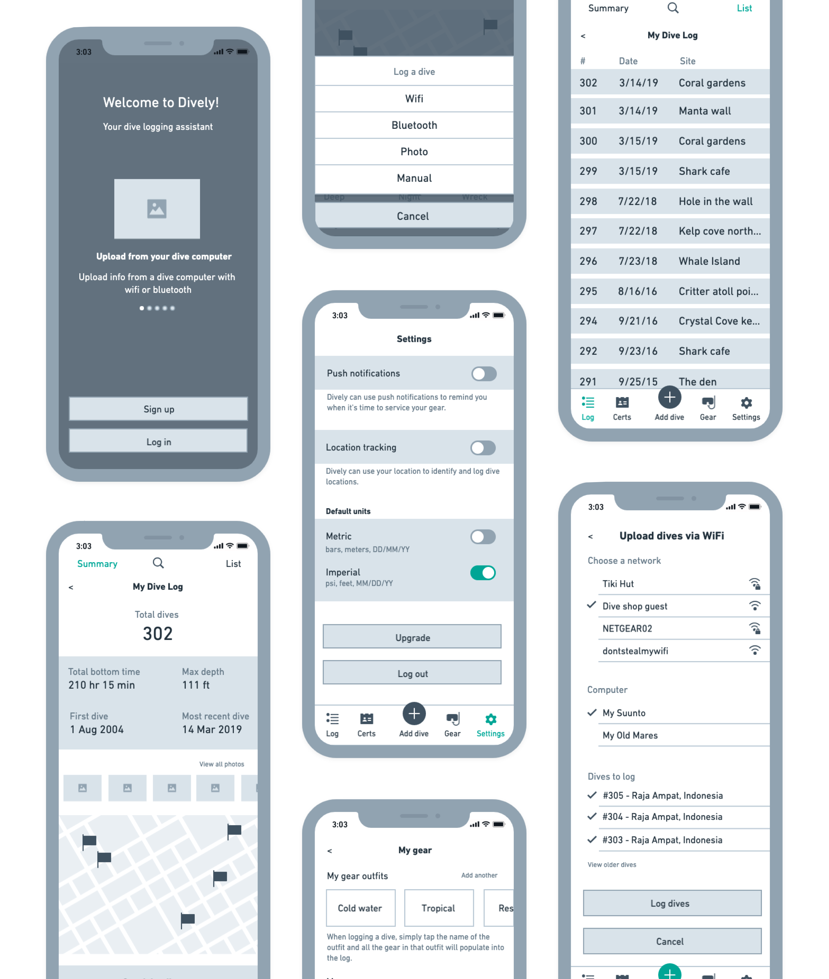
Until now, I had focused entirely on the desktop app. However, the hypothetical client introduced that they also wanted a mobile app. Without the resources to perform new research and wireframing for mobile, I used what I learned from the desktop to create mobile mockups.
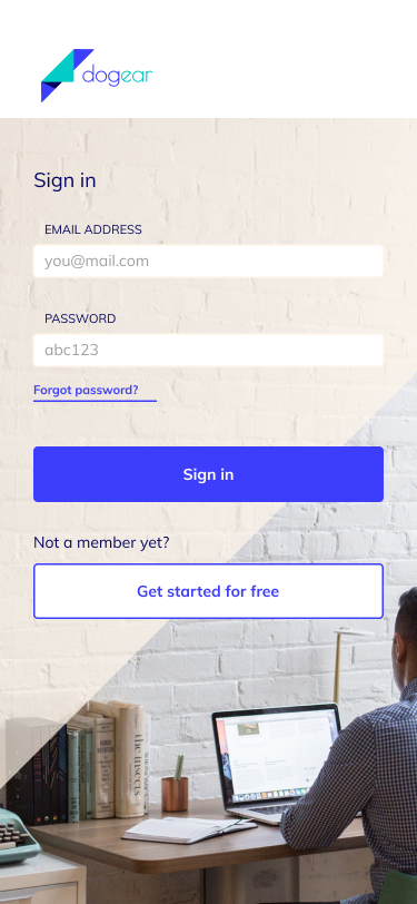
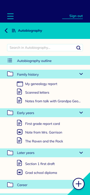
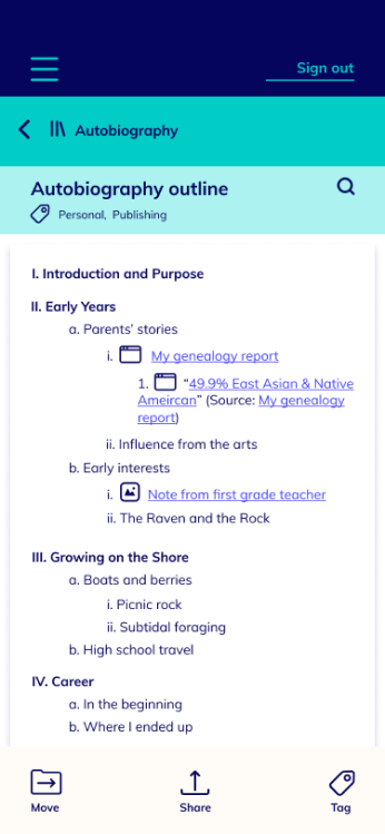
There were a few design questions that came up while making mockups:
I performed preference tests for each of the above questions, with 18-20 respondents per test. For two of the questions, the solutions were clear. For one - the mobile “Add” button - I needed to be a bit more creative.
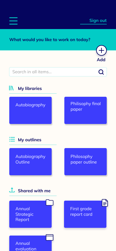
60% of participants selected this option, but noted issues like wasted space and the possibility of mis-clicks with the search field.
Some of the guidelines in the style guide didn’t quite work in practice. So, style guide and mockup development can be somewhat iterative.
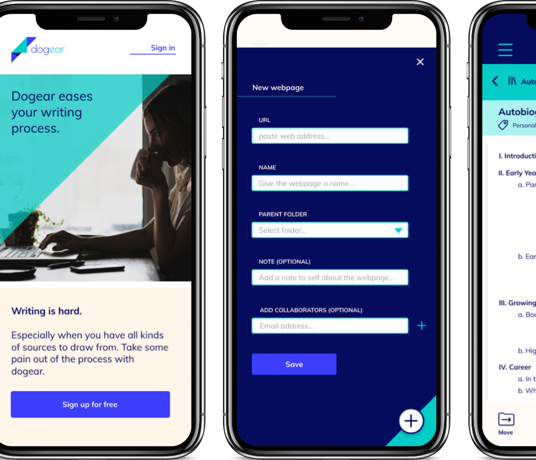
With revisions in place based on preference testing, I wanted to test the high-fidelity clickable prototype with users.
I called on three colleagues and family members to perform several tasks in the clickable prototypes.
The testers had some really useful insights. One faulty assumption that came to light involved the file organization structure. I had categorized libraries, outlines, and tags into separate, equal sections at the top of the file hierarchy. However, users expected their outlines and tags to reside within the relevant library.
Good point!
With these and other revisions in place, the dogear design assets are ready to hand off to developers.
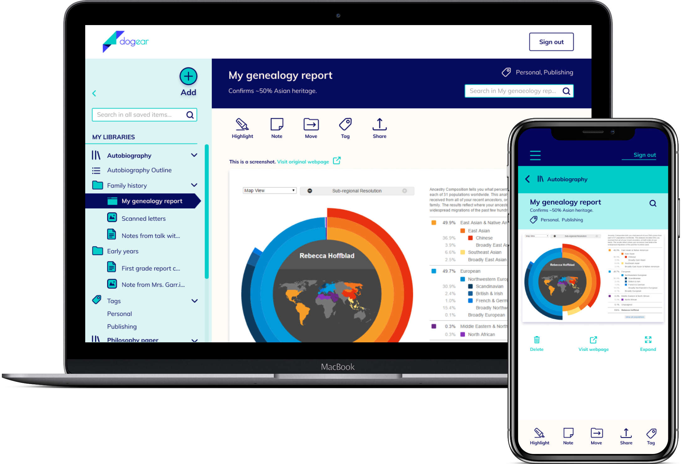
Technical and logistical issues can really change a user testing experience. For example, not everyone is comfortable using a buttonless Mac trackpad.
I wasn’t quite done, though. To me, the dogear logo was just asking to be animated.
I looked around for the appropriate software to create a custom animation, and fell into Adobe After Effects. It could use some finessing, but my hope is that an on-load animation like this would add meaning to the "Add" button and create a more memorable experience.
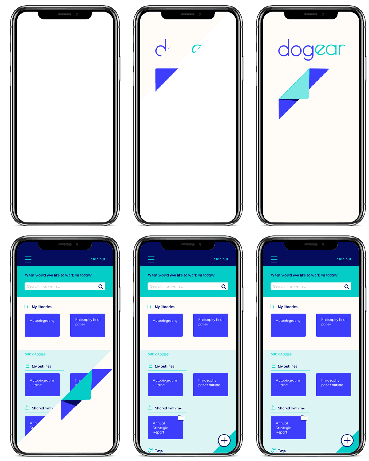
If coded up into an app for launch, I think dogear could in fact make writers’ lives easier.
There are some things I would experiment with further, like:
I would be excited to work with developers to implement all the functions that writers need most.
Until then, happy writing!